
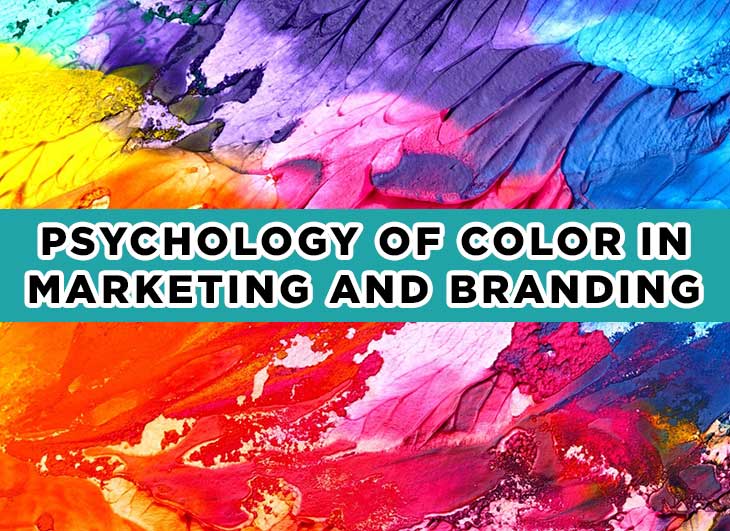
In marketing and branding, persuasion and color go together like needle and thread.
Over the years, claims have been made regarding the connection between color and these two.
However, all these have only been premature theories and assumptions. Until recently, a decisive tide of studies sprang forth to solidify such claims.
The psychology of color used as a branding and marketing technique reveals a noteworthy look into the corners of human behavior. Hence, we’ve decided to organize this number of thorough and credible studies into one sizable scroll.
Breaking down the Common Myths
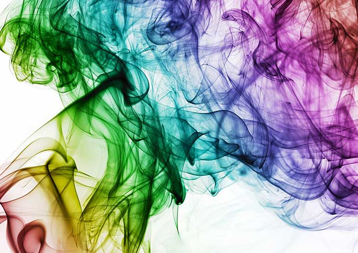
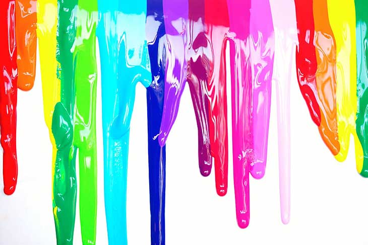
Yellow is to happiness as green is to peace, the environment, and so on. People sure like to place different meanings in various colors.
As time passes by, we’ve unconsciously entrenched such combinations in our minds. However, it’s worth looking past these usual color associations. It’s not the default. It hasn’t always stayed that way. As a matter of fact, it’s almost impossible to assume a single, universal translation of colors.
One interesting research illustrates how different elements influence the effect each color has on people. Elements like cultural practices, personal experiences, family upbringing all dazzle together to contribute to how we perceive individual colors.
In the scope of marketing and branding, the interplay of these forces enlivens and affects the entire process—a process coated with several persuasive strategies and tactics. Let’s examine more of this below.
How color influences branding
Let’s say there are two products before you. Will the color of these products impact your final selection? If so, in what way?
Perhaps a research entitled Impact of Color in Marketing will better get the idea across. In this intriguing study, color alone has been shown to command the selection of the participants in a sweeping 90% snap judgment.
A closer delve into this matter certainly lifts a little of the veil concerning branding and the psychology of color.
Now, going back. Why would it affect you in the first place? If you think about it, it would all go back to the contribution of different elements discussed above.
The color appropriateness of a product seals the decision of most people. A fancy, glittering, pinkish product of Harley Davidson won’t probably illuminate the rugged and sturdy appeal the brand represents, in a way, as well as the customer’s usual perception of the said brand.
The overall image and feel that the brand puts forth in its choice of color gives the customers an idea of its identity. Once a brand has started to utilize such a color, the portrayal by and by becomes two-way. The color, then, matches the personality that the brand aims to send.
In some way, this may even go contrary to popular associations. Brown may be usually used to send a rougher, solid personality of a Saddleback Leather product. Yet in another context, it may render a warm depiction of delectable chips of melting chocolate.
Hence, it really boils down to the kind of appeal brands want people to interpret, more than the usual stereotypical, cultural color tie-up.
This leads us to how the creation of brand identity relies heavily on colors. A substantial factor that most companies consider is the careful selection of color in the brand’s overall representation.
A lot of brands understand the value of logo colors in standing out from other competitors, as demonstrated clearly in Color Research & Application. For instance, the use of color blue in an ocean of oranges may probably have a more lasting impression.
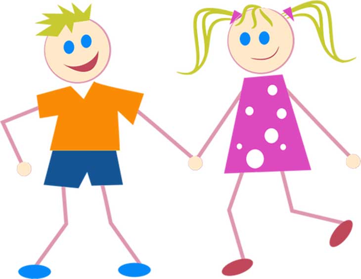
The pervasive hold of gender on color
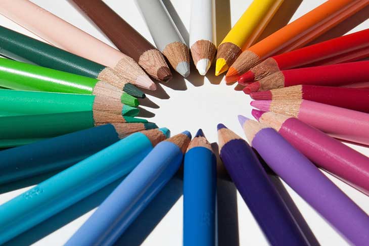
Firstly, who decides what is appropriate to color and what is not? Consider for a moment the deeper reason why your favorite color is your favorite color. Does a part of it include your personality, a bit of a cultural sprinkle, or more of a gender association?
Both men and women highly prefer blue as their favorite color. However, the difference expands when the color purple enters the picture. Apparently, purple is a dominant color in women’s favorites. For men, however, it’s an almost non-existent color, at least in the lane of their favorites.
The above scenario is what took place in a study done by Joe Hallock called Colour Assignments. In relation to this, even before, it’s hard to find a power tool or product that is coated in purple and the like. This may perhaps have a link in how cultures, and society as a whole, view the correlation between colors and gender, and its application to marketing. Several types of research signify how most women opt for softer colors while most men go for bolder colors in shades and tints.
It’s clear as day that there are some color preferences across gender. The collective perceptions of a certain culture also have a powerful force in the choice of individuals, and color is no exception.
With all this in mind, it’s interesting to note that pink used to be the color for boys and blue for girls back in the day. Such changes in gender-color-stereotypes can be used as a tool in business. Brands can catch up with the zeitgeist of a generation and complement the preferences of both women and men in color and products.
There’s a relationship between conversion rates and color
Let’s take a look at the well-known psychological principle called the Isolation effect. It indicates how a visibly unusual item has the highest potential to be noticed and imprinted in a person’s mind.
So, how is this connected to color and conversion rates? Well, designers of conversion rates on websites have their way of appealing to their customers. Their secret weapon? Color coordination.
Picture in your mind a page on conversion rates. Imagine that web design as having a number of green-colored icons, signs, and fonts. Now, out of the almost green-dominated page emerges a startlingly red button change that convincingly says, ‘Get Started Now!’
Did you see what happened there? The red button added a persuasive touch to the entire coordination of the colors. It acted as a tool to get the attention of the visitors of the page. And lo and behold, it was through the creation of contrast that turned them into customers!
Are you starting to see the picture now? But wait…
Apparently, a color’s name construction also has a say!
If you were to choose between brown and mocha, which one would you prefer?
For subjects of this thought-provoking study, the latter caught their interest. Using several products with various color names, the research showcased a really interesting side of human nature. When asked which one would fit their liking, the respondents picked a more strikingly-named color compared to the everyday brown, although both colors were just the same.
So the meat of the matter is: the more unique, the more marketable the product. Going for an uncommon name makes a compelling difference in introducing a color. This, as an aftereffect, becomes a major influencer in product purchase.
In a nutshell, color has been used as a vehicle for catching the interest of customers and discerning their usual approaches. As it turns out, the psychology of color is definitely colorful, in more ways than one. Welcome to 4inLanyards for more information.